UX Case study — Money Management App

Context
Unified Payments Interface is an instant real-time payment system developed by the National Payments Corporation of India in 2016. With this, there was the introduction and the rise of payment with QR code scanning, and in came applications that offered payment to various services and friends. Since then, India has been seeing a decline in cash payments.
In the past, we had to use excel sheets to track the savings spent but now with the integration of UPI and API Banking, tracking has become much easier as seen with the rise of money management apps.
Discovering the problem statement
My friend Ritesh and I were discussing this when it occurred to us that ever since college, we haven’t been very wise about spending money and have been scanning QR codes without making an effort to check our bank balance that often.
The reason could be laziness, the SMS summary feature that displays only the withdrawn amount, “password-protected check bank balance” feature in Google Pay that is listed at the bottom of the screen which doesn’t catch our eye.
This is when we came up with the idea of building a money management application that alerts us of our bank balance and tries to limit the amount which can be spent each month.
I took up the role of UX designer and tried to follow the design thinking process. This is the journey:

Empathize
To get started with user research, we sent a questionnaire to understand how users' spending habits. These were the responses.


Some of the applications the users used to monitor spending habits were: Notion, Splitwise, GoDutch, Wallet, and Spreadsheet.
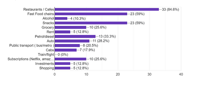
Next, we wanted to know the categories in which they spent more amount
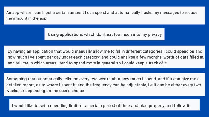
The last question was an open-ended one, what are the ways in which you’d like to monitor your spending habits?
These were some of the responses:
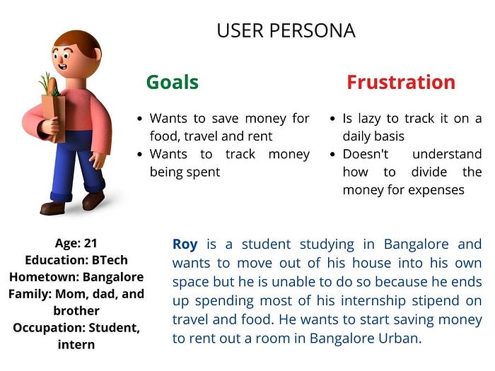
After which I tried to come up with a user persona
Then, I tried to understand what the user thinks, says, does, and feels with the help of an empathy map

Define
Based on the answers in the questionnaire, we went back to our initial ideas to refine them. We tried to understand, how we could help the money management process and why would users choose our solution? This is when we thought of a feature, which was mentioned in one of the responses to the questionnaire:
An application that would manually allow me to fill in different categories I could spend on and how much I’ve spent per day under each category, and could analyse a few months’ worth of data filled in, and tell me in which areas I tend to spend more in general so I could keep a track of it
Based on this and on further brainstorming we decided on some features of the application to start off with:
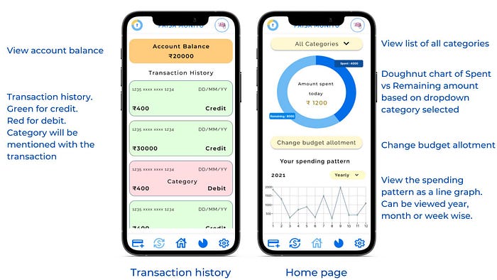
- Track spending habits through graphs and visual aid so that user can understand their patterns better
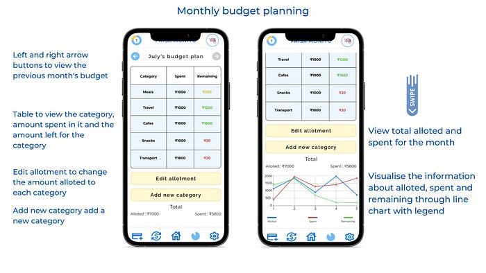
- Provide a feature to list down different categories and limit the amount spent across categories. Give users alerting notifications if they are close to the limit and might exhaust the amount soon.
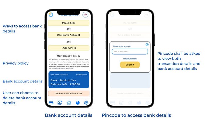
- Try to store the data of the users locally so that they aren’t worried about their privacy ( the idea came from Obsidian, a note-taking app that Ritesh uses that works with local mark-down files )
- Try to parse SMS instead of accessing bank details
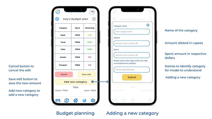
Prototype
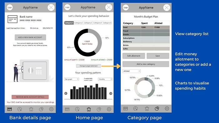
I went ahead and worked with wireframing to know how the features will fit in the application. This is how the wireframes looked :

The application used: RP Mockplus
Click to view the wireframe
Feedback on the wireframes :
Categories could be a droplist instead of a swipe bar.
Account balance could be added to the transactions page
Doughnut chart needs to have labels
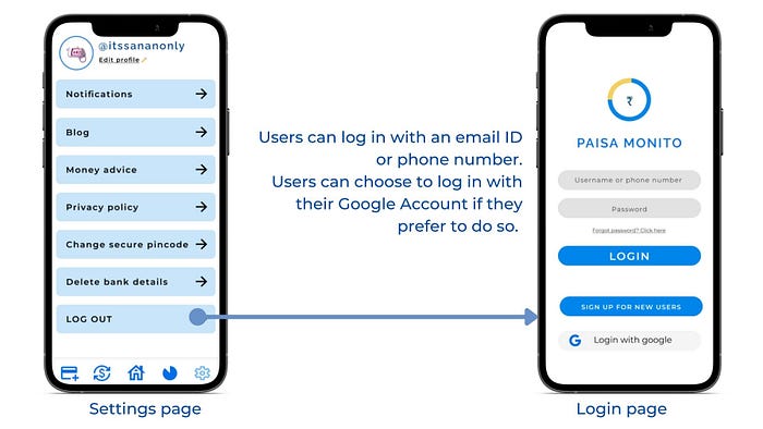
Final prototype based on feedback and further changes :
Future work
- Test it with users of different age groups to see what works and what doesn’t
2. As both Ritesh and I are front-end developers, we shall work on developing the prototype and understand how much of it is feasible.
3. Understand if local storage of bank details is feasible
My key takeaways
- Understood working with the design process
- Learned more about the user research process
- Worked on user persona and empathy maps
Conclusion
This was our journey on working with paisa monito. There will be changes in the future based on user feedback and while saying this, I hope you enjoyed reading this I would love to hear your thoughts about this case study in the comments below or you can reach out to me on LinkedIn.
Have a good day!

